Project Overview
This project involved a redesign of the Cluster Creation workflow in Gigamon Fabric Manager, with the core goal of improving usability issues in the current design and aligning it with the modern UI style guide.
The original design presented several challenges, including a cramped topology workspace, complex configurations hidden in menus, and highly repetitive CLI work. The redesign aimed to:
- Make the canvas workspace larger to let users arrange and manage nodes easily.
- Eliminate CLI usage by replacing complex commands with intuitive visual configurations.
- Provide a responsive drag-and-drop workspace to link interfaces (stack links) natively.
Design Goals & Impact
Reduction in cluster configuration steps and task duration.
Increase in user satisfaction scores (measured via post-task SUS surveys).
Visual compliance with the newly adopted enterprise design system.
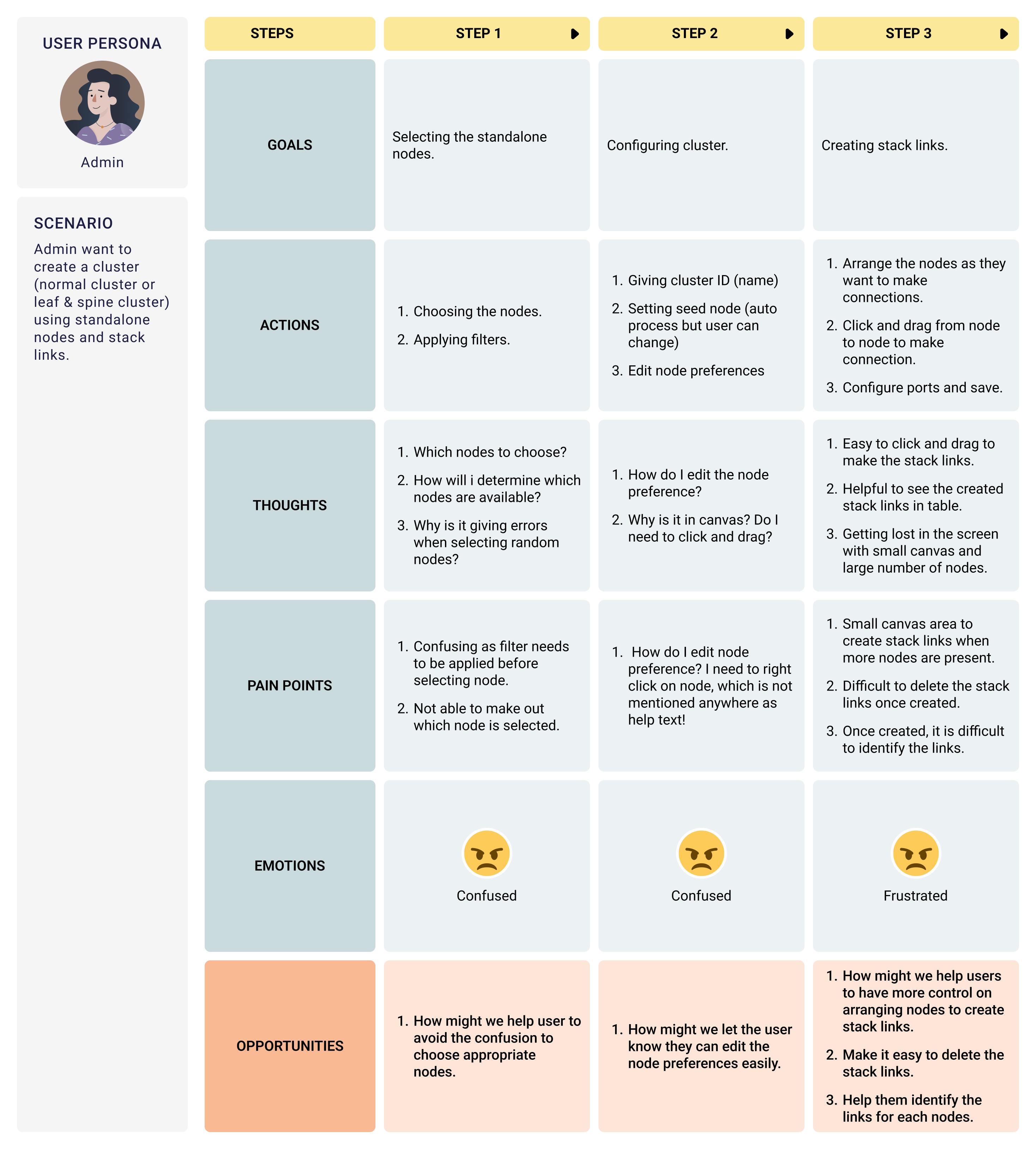
User Research & Discovery
We conducted stakeholder interviews and user testing sessions with network administrators to discover their primary friction points when configuring physical cluster structures.
Stakeholder Insights
Target User Persona
Admins & Engineers: Users with high system knowledge who are experts at Fabric Manager usage but prefer visual interfaces that map onto physical rack and topology spaces rather than executing heavy CLI lines.
Primary Usability Friction
- cramped Canvas: The workspace was small and could not be scaled, making it extremely tedious to link nodes together when configuring a massive list.
- Right-Click Discovered Preferences: Nodes required a right-click to edit preferences, with zero visual affordance or hints to guide the user.
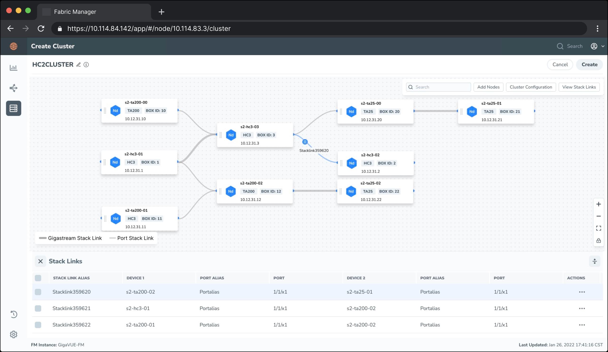
- Rigid Stack Link Actions: Deleting links between ports was incredibly difficult. Clicking links was imprecise, resulting in user frustration.
- Lack of Visual Distinction: Users could not quickly tell which connection represented a gigastream and which represented standard stack links.
Heuristic Analysis & CSD Chart
To align the product team, we synthesized our UX findings into Heuristics Violations lists and mapped out a CSD (Certainties, Suppositions, Doubts) Chart.
Top 3 Heuristic Violations Identified
1. Consistency & Standards
The dialog boxes, configuration fields, and alignment metrics failed to match the modern Fabric Manager design guidelines.
2. Flexibility & Efficiency
The static grid size restricted operators from working with large node topologies, raising cognitive load and layout clutter.
3. User Control & Freedom
Deleting incorrect stack links was cumbersome. Users lacked simple triggers to select, delete, or modify layout connections.
CSD Matrix Mapping
| Certainties (What we know) | Suppositions (What we assume) | Doubts (What we wonder) |
|---|---|---|
|
- Cluster requires 2+ standalone nodes. - Two cluster types: Normal & Leaf-Spine. - Stack links carry all user traffic. - A leader and worker architecture is required. |
- Drag-and-drop workspace is the preferred configuration model. - Node settings should be editable without right-clicking. - A separate landing page is needed for dashboard cluster logs. |
- Can we mix model numbers or firmware versions in a single cluster? - Is a separate cluster structure possible without setting up stack links? - Do we support hot-pluggable link alterations? |
Design, Workflows & Wireframes
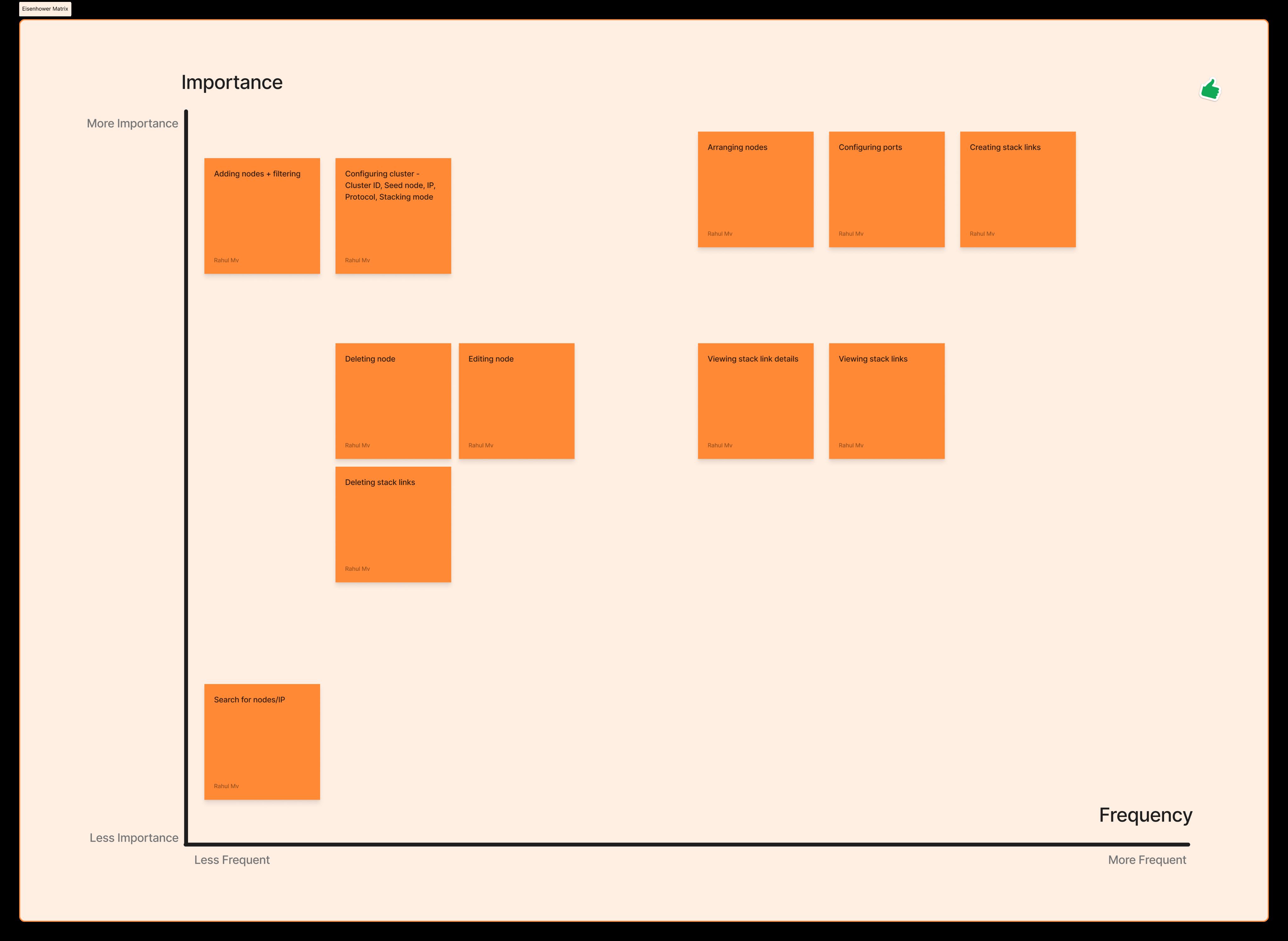
Before moving to pixel-perfect mockups, we mapped out a unified **Task Flow** and prioritised features using an **Eisenhower Matrix** to optimize engineering timelines.
Alternative Approaches Evaluated
Approach 1: Form-Based Creation (No Canvas)
We tested a canvas-free wizard. However, user reviews indicated it raised cognitive load because engineers had to visualize the network links in their memory.
Approach 2: Rigid Grid Topology
Restricting node positions to columns. Tested users felt constrained and links overlapped when connecting non-adjacent nodes.
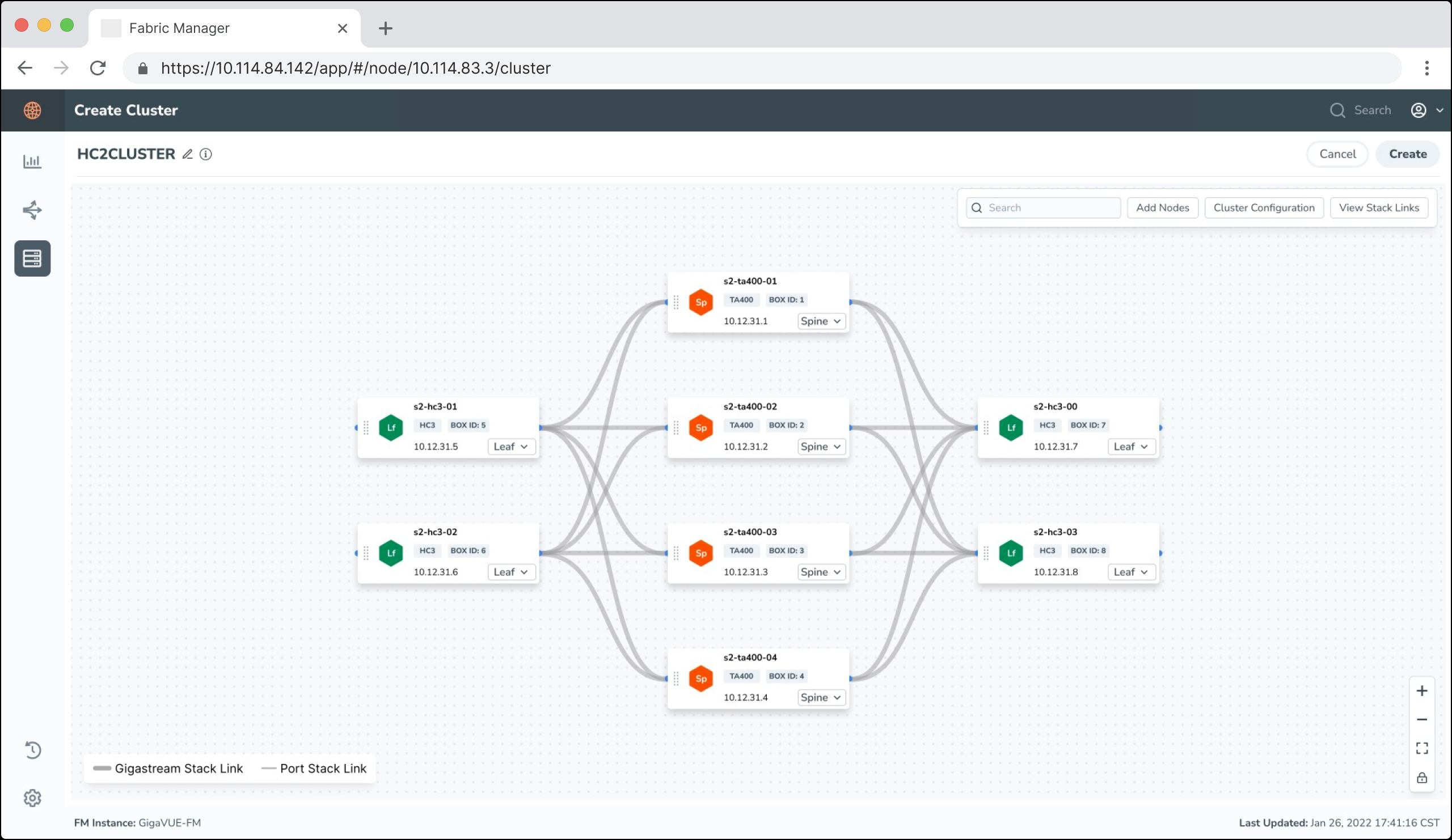
✔ Selected Approach: A completely free-form canvas allowing administrators to arrange nodes and draw stack links dynamically.
Core Features Prioritised
- Arranging nodes freely inside a larger canvas.
- Click-and-drag mechanics to link ports.
- Click node to edit configuration parameters.
- Action menu delete triggers for links.
- Visual thick/thin line weights to represent connection types (Gigastream vs port).
Before & After Comparison
The redesign successfully streamlined the experience. Review the key structural upgrades below:
BEFORE Cramped Dashboard Layout
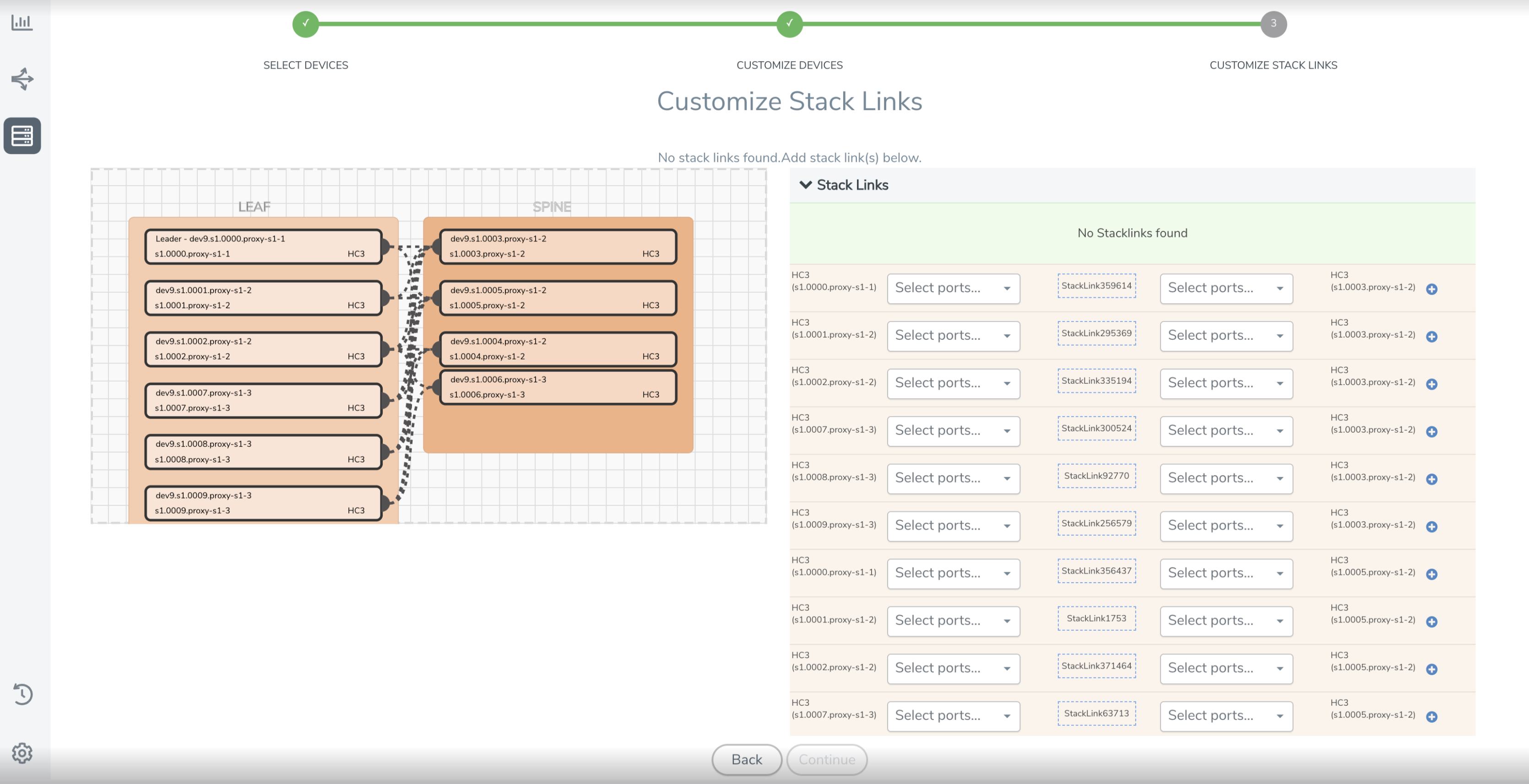
- Tiny widget canvas which resulted in clutter when adding more than 4 nodes.
- Confusing edit options hidden under right-click contexts.
- Cramped side config sheet that compressed content actions.
AFTER Spacious Redesigned Canvas
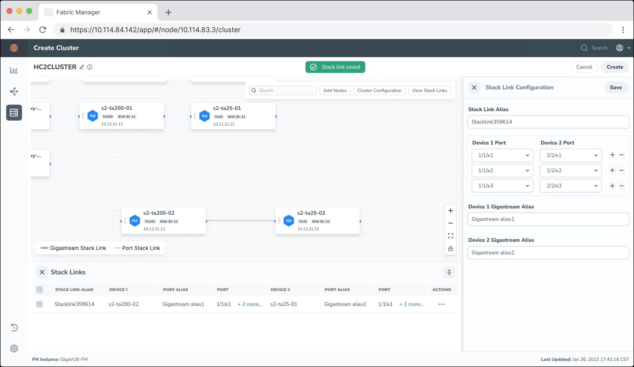
- Full screen scaleable canvas to fit massive corporate network diagrams.
- Clean sidebar listing node details instantly upon a simple left-click.
- Thick/thin line styles highlighting connection properties clearly.
Design Iterations & Version Review
We iterated through multiple screen adjustments based on direct design reviews and mock validation with technical stakeholders.
Refinement Takeaways
Through testing, we reduced visual noise by fading non-active link paths whenever a specific node is highlighted. We also added an absolute zoom toolbar control in Version 3 to enable fast map-scale manipulation. The final design was highly praised by engineering teams for matching coding conventions and styling specifications perfectly.
Looking for Enterprise UX solutions?
Let's discuss how we can optimize your complex product layouts and improve your team's task efficiency.
Collaborate on a Project