Project Context
FlexInline is one of the most powerful capabilities in GigaVUE-FM. It enables enterprise users to create sophisticated traffic inspection paths using inline networks, tools, and maps.
Unlike standard inline bypass, FlexInline guides traffic through user-defined sequences, allowing different flows from the same or multiple networks to pass through different tool paths while sharing resources where needed.
However, while the backend capabilities were functionally robust, customers struggled to understand, navigate, and manage their setups through the visual interface. Because CLI-created or modified solutions are not reliably manageable from Fabric Manager, the FM canvas was not just a visual layer—it was the product experience itself.
The Objective
Identify key operational usability barriers and redesign the visual system to satisfy three core criteria:
- Orientation: Clear understanding of what configuration is active.
- Discoverability: Explicit entry points for creation, editing, and filtering.
- Continuity: Lowering the overhead of transitioning between modes.
Discovery Phase
To align design targets with genuine technical pain points, I framed research objectives to address how users mentally modeled FlexInline configurations.
Research Objectives
- Identify how users discover existing FlexInline solutions inside Fabric Manager.
- Understand the friction points in the transition between viewing and editing configurations.
- Locate which visual structures on the canvas create the highest cognitive load.
- Map how network administrators mentally group and model FlexInline workflows.
Stakeholder Interviews
I collaborated with Product Management, Support Engineers, Sales Engineers, and the Customer Success team to gather multi-angle feedback:
Users frequently asked, "Which solution am I looking at?" The canvas showed device context but lacked clear solution-level labels.
Users were unsure whether they were in Status, Troubleshoot, or Configuration mode because the visual layouts were almost identical.
Users understood the technical concepts but struggled to discover where to start or what action was expected next.
Support teams spent hours troubleshooting because users could not visually distinguish maps, tools, and traffic directions in large diagrams.
Customer Interviews
Using customer support logs and feedback from a major client, United Health Group (UHG), I mapped out typical workflows to understand goals and obstacles across three primary user types.
Network Operations
User Type: NetOps Engineer
Goals
Monitor traffic flows, validate active tool chains, and troubleshoot anomalies quickly.
Key Pain Points
"I keep forgetting whether I'm in configuration or status."
"Everything on the canvas looks similar. I need to identify traffic paths quickly."
Network Architecture
User Type: Network Architect
Goals
Build new FlexInline solutions and modify complex existing topology maps.
Key Pain Points
"I don't know where to start creating a new solution."
"The canvas feels overwhelming when it first opens."
Security Operations
User Type: SecOps Engineer
Goals
Validate active traffic inspection paths and confirm secure traffic routing configurations.
Key Pain Points
"I can see a solution, but I don't know how to edit it."
"The workflow from viewing to editing feels disconnected."
Affinity Mapping
Observations and workflow reviews were grouped into four central themes of complexity.
Theme 1: Orientation
Users struggled to answer: "Where am I?" and "What solution am I viewing?" due to weak context labeling.
Theme 2: Mode Confusion
Users had difficulty distinguishing Status, Troubleshooting, and Configuration because views looked nearly identical.
Theme 3: Discoverability
Important triggers (Create buttons, Edit context options, Search fields) were hidden or missing entirely.
Theme 4: Visual Scanning
Users were unable to quickly scan and trace maps, tool chains, port aliases, and directional paths.
The User Journey Map
This journey highlights the points of friction during a standard inspection flow setup and debug task.
| Stage | User Goal | Pain Point |
|---|---|---|
| Open FlexInline | Understand the existing traffic routing structure. | Unsure which solution is loaded; background canvas lacks explicit identifiers. |
| Review Canvas | Trace tool paths and verify configurations. | Elements (networks, tools, maps) look too visually similar to scan quickly. |
| Troubleshoot | Analyze the current network state in real-time. | Cannot easily distinguish between view-only status and editable config. |
| Edit Solution | Make layout or connection adjustments. | The edit button is hidden; transitioning out of view mode breaks context. |
| Create New Solution | Initialize a new FlexInline configuration. | No guided wizard; dropped straight into blank canvas complexity. |
Problem Statement
Design Principles
Using Human-Centered Design methodology, we framed three guiding principles to steer our design responses:
- Improve Discoverability: Users must immediately know what actions are possible and where they are located.
- Strengthen Signifiers: Visual cues must clearly communicate current state variables (mode indicators, active solution context, highlighted nodes).
- Support Mental Models: The layout must represent the system structure in a way that matches how engineers reason about inspection workflows.
The Ideation Process
I hosted targeted workshops with cross-functional stakeholders to explore and iterate on solutions for each core theme.
1. Mode Separation
Canvas Styling Workshop
- ✗ Concept A: Keep one canvas style for all states (Rejected: forced users to infer context).
- ✗ Concept B: Add status banners (Rejected: too easy to overlook).
- ✓ Concept C: Plain canvas for Status, Dotted grid for Configuration (Selected: instant mode recognition).
2. Context Identification
Orientation Workshop
Challenge: How do users identify which solution is active?
Selected Direction: Combine left-panel solution selectors, a persistent header displaying device-solution links, and direct canvas title nodes.
3. Workflow Continuity
Continuity Workshop
Existing: View solution → leave view screen → open configuration list → find device → open edit canvas (highly fragmented).
Redesigned: View solution → Actions → Edit → Continue editing same configuration in-context.
Low-Fidelity Prototype Testing Results
Locate Solution: Users successfully discovered and activated layouts significantly faster using dedicated left-panel aliases.
Identify Mode: Users instantly understood their active state based on the plain vs. dotted grid pattern of the canvas.
Edit Solution: Operators strongly preferred continuing directly from active views instead of searching for separate menus.
Final Design Decisions
The mapping below connects specific research pain points directly to the redesign responses implemented on the FlexInline canvas.
| User Problem | Design Response |
|---|---|
| Cannot identify current solution | Solution aliases on the left panel, and a persistent status-context header showing Solution & Device details. |
| Cannot identify current mode | Plain background canvas representing Status Mode vs. dotted grid background canvas representing Configuration Mode. |
| Difficult transition to editing | Smoother view-to-edit path via Actions > Edit context buttons, keeping the solution loaded in place. |
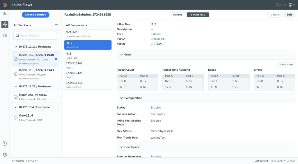
| Hard to scan visual canvas | Unique configuration icons, explicit directional indicators, customizable node colors, and toolbar status bars. |
| No clear starting point | Step-by-step guided configuration wizard for metadata, device selection, and alias assignment before landing on the canvas. |
| Large solutions difficult to manage | Integrated search panel for maps/tools, directional filtration keys, and a dynamically expanding canvas. |
Impact & Reflections
By centering the redesign on basic visibility and mental model principles, the FlexInline workspace became significantly easier to navigate and operate.
Core Usability Benefits
- Reduced overhead: Clearly demarcating viewing states from modification states.
- Consistent controls: Maintaining expert interactions like drag-and-drop while improving scannability.
- UHG Compliance: Met direct user requirements for color differentiation and port aliases.
UX Takeaway
This project reinforced that enterprise UX design is rarely about removing technical complexity. Rather, it is about making that complexity understandable.
By ensuring users can always quickly answer "Where am I?", "What am I looking at?", and "What can I do next?", we turned a screen refresh into a workflow improvement that benefits experienced operators handling advanced configuration structures.
Before & After Design Comparison
A direct visual comparison highlighting how the structural design choices resolved real usability gaps.
OLD DESIGN Cluttered & Unstructured
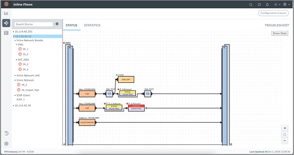
- Status and troubleshooting views used a white grid which made them look identical to configuration workspace layouts, creating intense mode confusion.
- Lack of solution contextual headers, forcing network administrators to cross-check sidebar listings to infer what solution they were inspecting.
- Visual items (bypass tools, collector maps, normal maps) lacked clear visual grouping, creating scannability delays.
NEW DESIGN Modern & Mode-Oriented
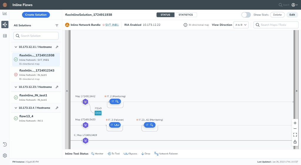
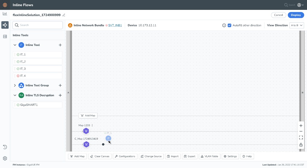
- Plain canvas for status view versus dotted canvas grid patterns for configuration edit mode, serving as instant spatial orientation cues.
- Persistent solution aliases listed explicitly inside a left navigation selection dashboard, matching active header links.
- Clean left toolboxes, clear icon configurations, customizable colors for maps/tools, and dedicated statistics/action buttons.
Looking for Enterprise UX solutions?
Let's discuss how we can optimize your complex product layouts and improve your team's task efficiency.
Collaborate on a Project